Quick verdict:
If you’re not sure where to place your logo, go with left chest (3.5” wide, 7”–9” down) or center chest (8”–10” wide, 3”–4” below the collar). These placements are clean, consistent, and proven to convert well across all major POD platforms.
Logo placement isn’t just a design detail—it’s one of the first things your customer notices. Get it right, and your shirts look polished and professional.
Get it wrong, and they look cheap, even if your design is great. This guide breaks down the best placements, exact measurements, and the most common mistakes to avoid, so your shirts look as good in real life as they do in the mockup.
TL;DR – Logo Placement on Shirts for Print-On-Demand
- Best placement:
Start with left chest (3.5” wide, 7”–9” down from collar) or center chest (8”–10” wide, 3”–4” below collar). These convert best and look clean on most shirt types. - Avoid:
Logos that are too low, too close to the collar, or oversized. Poor placement leads to refunds and lost trust. - By shirt type:
- V-necks: Lower the logo slightly to avoid awkward overlap
- Hoodies: Use left chest or sleeve; center can get covered by strings
- Women’s cuts: Shift logo lower by 0.5”–1” to align with body shape
- Mockups lie:
Use real templates and test prints. Digital previews often don’t reflect real-world sizing and alignment. - Top tools:
Use Printful’s or Printify’s templates, Smartmockups, and Placeit for realistic views. - Verdict:
Don’t guess. Use proven placements, adjust by garment type, and test before scaling. It’s not about flashy design — it’s about clean execution.
1. Why Logo Placement Matters for Print-On-Demand Success
In the world of print-on-demand, visual trust is one of your most powerful assets. A shirt design might look great on screen, but if the logo is even slightly off in size or placement, it can instantly make the product feel cheap or unprofessional. Your customer might not know why something looks off — but they’ll feel it, and that hesitation often means no sale.
POD sellers often rely too heavily on default placement tools. Each platform – Printful, Printify, Redbubble, Gooten – has its own print areas, mockups, and templates. These visualizers are helpful, but they aren’t always accurate.
A mockup might show the logo centered and balanced, but when the shirt is printed and worn, the design can sit too low, hug the collar, or look oversized on the chest.
This becomes even more important on mobile, where most customers do their shopping. Shopify reports that over 73% of eCommerce traffic now comes from mobile devices.
Logos that are slightly misaligned or poorly scaled can appear especially awkward when viewed on a small screen. In a crowded product listing page, that mistake can cause shoppers to keep scrolling.
Here’s why accurate logo placement directly affects your success:
- First impressions matter – A logo that’s too large or too small can make your entire brand seem low-quality.
- Returns and refunds increase – Misplaced designs lead to higher dissatisfaction rates, and customers will often request replacements or refunds.
- Conversions drop – If the product doesn’t feel polished, customers won’t trust the brand enough to purchase.
Most Common POD Logo Placement Pitfalls:
| Problem | Cause | Result |
|---|---|---|
| Logo too high | Misjudging collar distance | Feels cramped, awkward on body |
| Logo too low | Poor visual centering | Looks sloppy or unbalanced |
| Oversized logo | Trying to fill entire print area | Feels cheap, especially on small sizes |
| Misaligned placement | No use of grid guides or templates | Amateur design, trust issues |
To avoid these issues, always take time to:
- Use platform-specific print file templates (usually in PDF or PSD format).
- Preview your designs on actual blank shirt mockups (not just flat renders).
- Order a test print if launching a new design or shirt style.
- Check mobile appearance and zoom into the mockup to ensure proportionality.
Logo placement isn’t just about making the shirt look “nice.” It’s a core part of your brand presentation. Even a basic shirt with a small logo can outsell complex graphics if the placement feels balanced and professional. That’s why getting this right upfront can save you time, reduce refunds, and increase long-term conversion rates.
2. The Most Common Logo Placements (And When to Use Each One)
When it comes to logo placement on shirts, most successful designs fall into one of a few standard areas. These placements aren’t random—they’ve been tested across thousands of POD stores, and each serves a specific purpose. Picking the right one depends on your brand style, shirt type, and customer expectations.
Here’s a breakdown of the most common logo placements and their ideal use cases:
Left Chest Placement
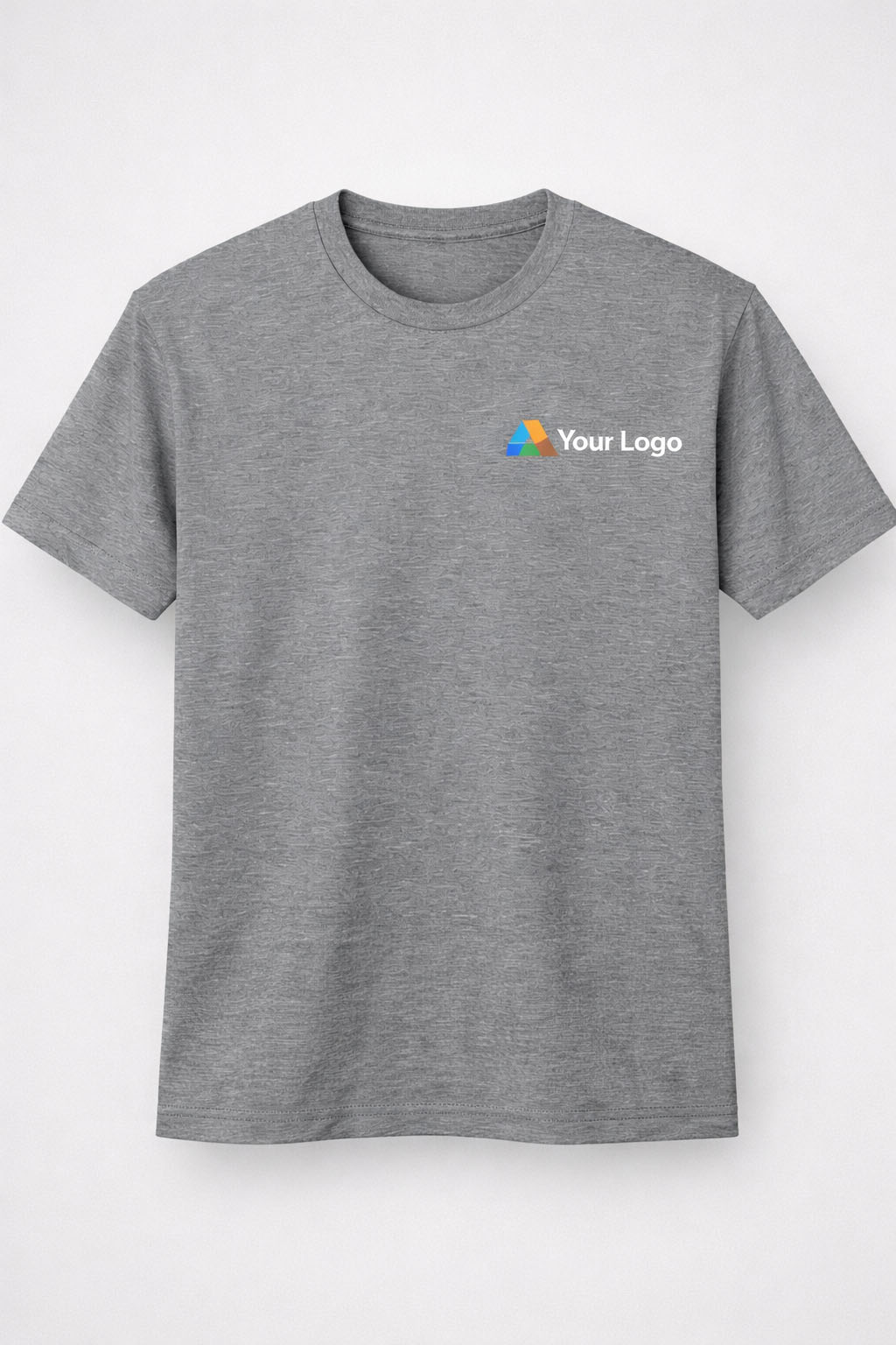
This is the go-to for many print-on-demand sellers because it’s clean, versatile, and works on almost any type of shirt. The left chest placement gives off a professional, branded feel without shouting. It’s also the default choice for many corporate designs and minimalist fashion labels.
Because it’s subtle and doesn’t dominate the shirt, it’s perfect for brands that want to convey trust and consistency. Left chest logos also translate well across shirt types — from tees to hoodies to polos.
Recommended Specs:
- Logo Size: 3”–4” wide
- Placement: 7”–9” down from the collar seam, 4” from center
Best for:
- Corporate POD products
- Minimalist streetwear brands
- Embroidered designs
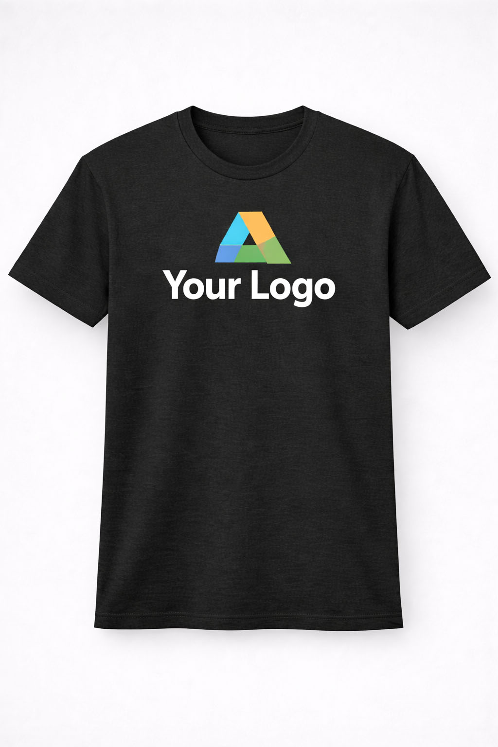
Center Chest Placement

This placement is much more direct and visually commanding. It’s ideal for bold logos, typography-based designs, or slogan tees. Center chest logos are immediately visible, making them the go-to for content creators, fan merch, and trend-based t-shirt drops.
If your goal is to grab attention from the first glance, especially in a crowded feed or product page, this is the placement to use. Just make sure the size is dialed in correctly — oversized logos here can feel aggressive if not done tastefully.
Recommended Specs:
- Logo Size: 8”–10” wide
- Placement: 3”–4” below the collar, centered horizontally
Best for:
- Pop culture shirts
- Limited edition drops
- Graphic-heavy designs
Full Front Placement
Full front placement covers the entire printable area on the shirt and is commonly used for detailed artwork, complex branding, or fashion-forward designs. This placement is bold and makes a strong visual impact, which is why it’s often used in streetwear, gaming merch, or licensed character designs.
Keep in mind that filling the entire print area doesn’t always work across all shirt sizes — it may overwhelm smaller sizes or appear inconsistent if the artwork isn’t well-balanced. It’s great for making a statement but requires precise alignment and high-resolution files.
Recommended Specs:
- Logo Size: 10”–12” wide
- Placement: Starts 3”–4” from collar, extends to mid-ab
Best for:
- Artistic designs
- Streetwear brands
- Loud and large graphics
Sleeve Placement
Sleeve logo placement has become more popular in recent years, especially among premium brands and streetwear labels. It adds an extra layer of design without interfering with the shirt’s main aesthetic. Logos on the sleeve are perfect for secondary branding — think icons, initials, or subtle taglines.
This type of placement works best as an add-on or upsell for shoppers looking for something unique. It also gives you more space to build a brand identity, especially when combined with chest or back prints.
Recommended Specs:
- Logo Size: 2”–2.5”
- Placement: Midpoint of sleeve (left or right)
Best for:
- Brand reinforcement
- Layered designs
- Upselling premium tees
Upper Back Placement

The upper back area is ideal for subtle branding. Positioned just below the collar, this spot works well when combined with front placement or when the shirt is part of a collection. It’s popular for gym wear, team shirts, and apparel that includes customer or company branding on both sides.
It’s also a smart way to add visual interest without overwhelming the front. This placement feels complete when done right, adding polish to even the simplest shirt designs.
Recommended Specs:
- Logo Size: 3”–4”
- Placement: 1”–3” under the collar
Best for:
- Gym shirts
- Fashion lines
- Secondary branding elements
3. T-Shirt Logo Placement by Shirt Type: Why One Size Doesn’t Fit All
One common mistake in print-on-demand is assuming that one placement works across all shirt types. In reality, the optimal placement can shift depending on the cut, collar type, and even fabric of the shirt you’re working with. Here’s how placement changes based on different shirt types:
Crew Neck vs. V-Neck
- Crew necks provide a consistent baseline from collar to chest. Placement is more predictable.
- V-necks require lowering the logo slightly to avoid awkward positioning over the “V” dip.
- A centered logo on a v-neck that’s placed too high can distort the design or look uneven.
Long Sleeve vs. Short Sleeve
- Short sleeve shirts usually accommodate standard placements easily.
- Long sleeve shirts offer more creative flexibility, especially for sleeve logos.
- Consider printing down the arm or including wrist branding.
Hoodies and Sweatshirts
- The added thickness of fabric and seams can impact placement precision.
- For hoodies, left chest placement is more reliable since center chest logos can get hidden by the hood strings.
- Printing on sleeves or the back is more common in outerwear products to avoid hoodie-specific limitations.
Women’s Shirts vs. Men’s Shirts
- Women’s shirt cuts are often more fitted, with shorter torso lengths and narrower chest widths.
- Adjust placement vertically by about 0.5”–1” lower on women’s cuts to account for body shape.
- Avoid oversized logo placements that could wrap awkwardly around the chest area.
These adjustments may seem minor, but they significantly improve the look and feel of the final product. Test placements on real blank mockups or order samples before launching your final design.
4. Why Your Mockups Lie — And How to Fix It
Digital mockups are a key part of selling print-on-demand shirts, but they can be extremely misleading when it comes to logo placement. Most POD platforms provide auto-generated previews that show your design centered and proportioned correctly, but these images often don’t reflect how the product will look in real life.
Here’s why:
- Mockups are flat – They don’t account for the natural curvature of a chest or how fabric stretches when worn.
- Scaling is inconsistent – A 10” wide logo may look balanced in the mockup but will feel oversized in person.
- Perspective is limited – Many mockups don’t include side or angled views, so sleeve and upper back placements are often guessed.
How to Fix This:
- Use template files provided by POD platforms. These files show the safe zones and exact placement areas.
- Order sample products to see how your design prints in real life. This is especially important for large-volume sellers.
- Upload your design to advanced mockup generators like Smartmockups or Placeit to get more realistic visuals.
- Check your mockup on mobile screens. Roughly 70% of eCommerce traffic is mobile, and mockups need to hold up at small sizes.
Getting placement right starts with viewing your product the way customers will.
5. Logo Placement Mistakes That Kill Sales
Placing a logo on a shirt sounds simple, but there are a few common mistakes that repeatedly lead to low conversion rates, poor reviews, or even returns. Avoiding these can save you time, money, and headaches in the long run.
The Most Common Mistakes:
- Logo too low – This throws off the shirt’s visual balance and makes it look sloppy.
- Logo too high – A logo that’s too close to the collar can look crammed or get distorted.
- Oversized logos – A logo that spans the full chest can feel overwhelming unless it’s designed to make a statement.
- Not centered properly – Misalignment is one of the most obvious signs of poor POD design.
- Low resolution files – A pixelated logo instantly makes your product look cheap and untrustworthy.
How to Avoid These Issues:
- Stick with standard measurements (3”–4” wide for chest logos).
- Use grid overlays during design to ensure perfect alignment.
- Always check DPI (dots per inch). Your image should be at least 300 DPI.
- Make use of test prints, especially for designs intended to be evergreen or evergreen sellers.
In print-on-demand, quality control is pre-production. Once it’s printed and shipped, your reputation is on the line.
6. Tools and Templates to Get Placement Right Every Time
There’s no need to guess your way through logo placement. Several tools exist to help POD sellers get it right without spending hours on trial and error. Many platforms offer free resources, and there are premium tools for more advanced needs.
Free Tools to Start With:
- Printful Print File Templates – Includes guides for each shirt style
- Printify Mockup Generator – Lets you adjust placement visually
- Canva + Smartmockups Integration – Combine design and mockups
- GIMP or Photoshop – Use with downloadable PSD templates
Premium Tools Worth Using:
- Placeit.net – Offers realistic model mockups with better visual previews
- T-Shirt Design Maker by Vexels – Includes proper placement zones
- Adobe Illustrator T-Shirt Templates – Ideal for vector-based editing
By using these resources, you can drastically reduce errors and improve your store’s visual appeal. Your designs don’t need to be complicated to look great—they just need to be placed with precision.
7. Real-World Examples That Prove It Works
To understand just how much of a difference placement can make, here are a few real-world examples from POD sellers and apparel brands.
Minimalist Brand Goes Viral
A small minimalist brand started with full-front logos but wasn’t making consistent sales. They switched to left chest placement with a 3.5” logo, added a matching sleeve print, and doubled their conversion rate in two months.
Shopify Store Boosts AOV
A Shopify store focused on fitness merch tested a center chest vs. left chest logo and found that left chest designs not only converted better but also encouraged customers to buy matching hoodies and joggers. Their average order value increased by 18%.
Redbubble Bestseller Strategy
One artist selling on Redbubble ranked in the top 1% of t-shirt sales after shifting all logo-based shirts to center chest placement with max width at 9.5 inches. Sales jumped after optimizing for mobile screens.
These aren’t exceptions—they’re the result of understanding placement psychology and applying it with consistency.
Final Thoughts: Keep It Simple, Make It Clean
When it comes to logo placement on shirts, simplicity and accuracy beat creativity every time. You don’t need to reinvent the wheel—just use placements that are already proven to work. Stick with left chest or center chest if you’re unsure. Get the sizing right, use proper templates, and always check how the mockup looks on both desktop and mobile.
Bad placement makes a good design look bad. Good placement makes a basic design look premium.
If you’re serious about growing your print-on-demand business, these little tweaks can have a big impact. They help reduce returns, increase trust, and make your shirts stand out without needing flashy graphics or gimmicks.
Test it, tweak it, then scale what works.
FAQs
Left chest and center chest placements are the most reliable and professional-looking options for most shirt styles and print-on-demand stores.
For chest logos, 3–4” wide works best. For center chest or full-front designs, use 8–12” wide depending on shirt size and layout.
Not always. Adjust for v-necks, hoodies, and women’s cuts to keep the logo from sitting too high or getting hidden by seams or hood strings.
Printful and Printify recommend chest logos around 3.5” wide and full-front prints between 10”–12” wide within a 12” × 16” print area.
Mockups are flat and can be misleading. Always test print or use real templates to check scale, alignment, and how the design looks on a body.